pset 01: the adventure of the dark genomes
G. Lestrade, a bumbling postdoc in your lab, has isolated and sequenced a new set of 673 phage from the gut microbiome of a coal-black hound that he tracked on the moors.
Lestrade's long ORF coverage analysis
Lestrade is trying to predict protein-coding open reading frames in these genome sequences. Instead of using a proper computational "genefinding" program, Real genefinders typically use probability models. We'll see them later in the course... and even write one of our own. he's merely identifying every open reading frame of at least 200 amino acids. He read somewhere that open reading frames \(\geq\) 100aa long are supposed to be unlikely to occur by chance, and thus 100aa is the commonly used threshold for calling putative coding regions in many genomes. He's using 200aa to be on the safe side.
You're already nervous about this because even for long \(\geq\) 200aa ORFs, it's a leap to assume that a long ORF is likely to be a protein-coding region. You don't necessarily believe what people say in the literature, and you'd like to see data or analysis to convince you that 100aa or 200aa ORFs don't occur frequently by chance in a random DNA sequence.
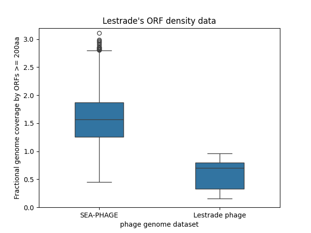 A boring box plot plotting the fraction
of genome covered by long ORFs of at least 200 amino acids, for 4924
SEA-PHAGE genomes and for Lestrade's 673 new phage genomes.
The SEA-PHAGE genomes have surprisingly high long ORF coverage,
and the new Lestrade phage have surprisingly low long ORF coverage.
(right click and "Open in New Tab" to embiggen)
A boring box plot plotting the fraction
of genome covered by long ORFs of at least 200 amino acids, for 4924
SEA-PHAGE genomes and for Lestrade's 673 new phage genomes.
The SEA-PHAGE genomes have surprisingly high long ORF coverage,
and the new Lestrade phage have surprisingly low long ORF coverage.
(right click and "Open in New Tab" to embiggen)
But setting that aside for a moment, even with his simple "long ORF" analysis, Lestrade has already gotten some strange results, shown in the figure to the right.
Phage genomes are compact and coding-dense. In phage T4, annotated protein-coding genes cover almost 100% of the genome, and annotated protein-coding genes that are 200aa long or more cover about 66% of the genome. So 60-70% coverage is probably about what we expect, if Lestrade's long ORFs are all truly protein-coding genes.
Here, Lestrade analyzed 4924 SEA-PHAGE genomes for coverage by long ORFs of at least 200aa. He's simply taking the ratio of the total length of long ORFs in all six frames, over the total length of the genome, so his coverage statistic can range from 0 to 6. He sees that the SEA-PHAGE genomes have surprisingly high ORF coverage, with a mean of about 1.5 (150%), meaning there are a lot of overlapping ORFs in different frames. In contrast, in his 673 newly sequenced phage, he finds surprisingly low long ORF coverage, with the distribution dipping well below 0.5 (50%) for many of the genomes.
 Strip plot of the same long ORF coverage data. In the strip plot,
it's clear that the Lestrade phage distribution is bimodal, which a
box plot hides. Many phage have the expected long ORF coverage, but there's
a substantial set of phage with quite low long ORF coverage.
(right click and "Open in New Tab" to embiggen)
Strip plot of the same long ORF coverage data. In the strip plot,
it's clear that the Lestrade phage distribution is bimodal, which a
box plot hides. Many phage have the expected long ORF coverage, but there's
a substantial set of phage with quite low long ORF coverage.
(right click and "Open in New Tab" to embiggen)
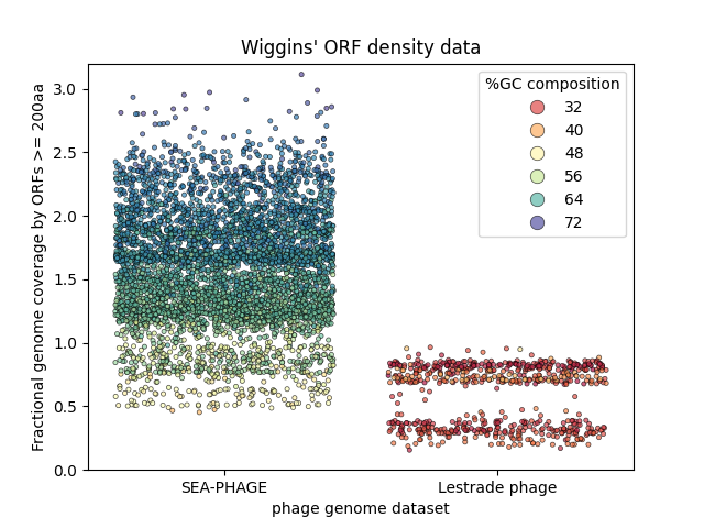
Wiggins' reanalysis
Wiggins, one of several enterprising undergraduates working on and off in the lab, has reanalyzed Lestrade's data set. Instead of plotting it as a typical box-and-whiskers plot, he plotted it as a "strip plot" where every individual data point (each genome) is plotted. Wiggins explains that when he took MCB112, he was taught that box plots are evil. Wiggins suspects that a major difference between the two datasets might be the GC% composition of the genomes, and that this might somehow be a factor in the surprising variance of the long ORF coverage. In his plot, he colored each point in a heat map according to GC% composition.
We're not yet doing tabular data plotting nor preaching the evils of box plots - some of which comes later in the course - but you can download Wiggins' script for generating this plot and Lestrade's tabular data for long ORF coverage and GC% composition if you like, to see how this figure was generated with Pandas and Seaborn - and to get a jump on the next couple of weeks.
From Wiggins' plot, we can see that for the SEA-PHAGE, GC% composition clearly correlates strongly with fractional long ORF coverage. The SEA-PHAGE are generally quite GC-rich overall. The few that have relatively uniform (50%) GC% composition do tend to have long ORF coverage around what we expect from phage T4. But the higher the GC% composition goes, the higher the long ORF coverage goes, even up to 300% of the genome in some cases.
OK, that already demands an explanation - but it's the Lestrade phage where things get really strange. Wiggins' plot shows that the distribution of long ORF coverage in the Lestrade phage is strikingly bimodal. There is a set of phage with the expected long ORF coverage around 70% - and a distinct second set with unusually low long ORF coverages around 30-40%.
Moriarty points to that set of phage and says, aha, these are dark matter phage! He says that they must be using noncoding RNA genes instead of protein-coding genes, and that explains why they don't have as many long ORFS. He offers to write up a manuscript for Nature, and offers Lestrade middle authorship, with himself as first and last author.
your two hypotheses
You're not a fan of Moriarty's dark matter phage hypothesis. You think two things are happening:
-
GC% composition could have a strong effect on the probability of seeing a long ORF, because stop codons are AT-rich (TAA, TAG, TGA). In genomes with normal (50% GC composition) or AT-rich genomes, maybe 200aa is a safe cutoff for identifying real coding regions, but in the GC-rich SEA-PHAGE genomes, your bet is that there are many spurious false positives (i.e. ORFs that occur by chance, as opposed to ORFs that are real protein-coding genes). False positives would artifactually inflate Lestrade's long-ORF-coverage statistic.
-
You recall that the standard genetic code is not completely universal. Various alternative genetic codes are known in a variety of genomes, including bacteriophages. The most common change in an alternative genetic code is to read one of the stop codons (usually TAG or TGA) as a sense codon, inserting an amino acid at that position. If a genome were TAG-recoded or TGA-recoded, it would have TAG or TGA codons in its protein coding ORFs. When you did a "long ORF coverage" analysis using the standard genetic code (as Lestrade did), these coding regions would be broken into small pieces, and you would observe abnormally low long ORF coverage. This effect would appear strongest in phage where almost all long ORFs were real coding regions - in AT-rich phage, which is exactly what Lestrade has. You think that Lestrade has accidentally stumbled on a remarkably easy computational screen for phage with alternative genetic codes that recode a stop codon, a screen that someone (ahem, cough cough) could write in a modest few lines of basic Python.
Moriarty says that your ideas are rubbish. He says your second idea is particularly stupid, so stupid that he will give you 10 AT-rich phage genomes, 2 of which are known to be TAG-recoded, 2 known to be TGA-recoded, and 6 known to use the standard code, and he bets you a bag of donuts that you can't tell which is which with your dumb idea.
your tasks for the pset
-
Write a function to calculate the long ORF coverage fraction, given a DNA sequence as input, a minimum long ORF length, and which set of codons to use as stops.
An "open reading frame" is any sequence of triplets free of stop codons. An ORF starts with any sense codon; it does not have to start with an ATG. If you like your ORFs to start with ATG, you could probably do the analysis with ATG-initiated ORFs and get similar results, but I haven't tried.
Count long ORFs in all six frames: the three frames on the top strand, and remember to reverse complement the genome and look at the three frames on the other strand too.
Note that you don't have to translate, you just need to count. You don't need a genetic code table; you just need to know which codons are stops, and the rest of them are sense codons that can start or continue an ORF.
-
To address your first hypothesis, write a function to generate a synthetic random DNA sequence of a given GC composition. Use this to do a negative control experiment: generate sequences of different GC compositions and see how the long ORF coverage statistic depends on GC% composition.
We're not plotting yet, so your results can be summarized in a table.
Explain what you think the simulation results show. For what GC% composition is it relatively safe to consider long ORFs to be statistically significant, relative to random expectation, and thus reasonable to infer that they're protein-coding regions?
-
To address your second hypothesis, first get the 10 phage genomes that Moriarty challenged you with, by one of three methods:
a. Download the compressed tarball phage-genomes.tar.gz by right-clicking; uncompress and untar in your notebook directory with
tar zxf phage-genomes.tar.gz. It will unpack to 10 FASTA files. Tarballs are a common distribution mechanism for supplementary data downloads and source code downloads. You need to have atarprogram installed (it stands for "tape archive": old school!), andgzip(the GNU project's zip compressor and uncompressor). Most UNIX-y environments will have these; if not, standard package managers on your platform will be able to install them for you.b. If right-clicking doesn't work, use
curlorwgetto download the URL. For example:wget http://mcb112.org/w01/phage-genomes.tar.gz. Then proceed with thetarabove.c. If
tardoesn't work, download the 10 phage genomes individually: [arugula] [basil] [chickpea] [gooseberry] [huckleberry] [juniper] [lentil] [quince] [sage] [tangerine] -
These files are in FASTA format. Write a function that takes the name of a sequence file as input, parses the sequence file, and returns the DNA sequence.
-
For each of the 10 genomes, read the sequence in from its FASTA file and calculate its long ORF coverage fraction using the standard genetic code, using TAG recoded as a sense codon (when only TAA|TGA are stops), and using TGA recoded (when only TAA|TAG are stops). Output a table with a row for each phage, showing these coverage fractions for each of the three genetic codes, and also showing the ratios for TAG coverage/standard coverage and TGA coverage/standard coverage.
Using fewer stop codons, of course the coverage has to go up a little (because you'll falsely extend some true coding regions, if you don't count their true stop codon as a stop), so those ratios are always >1. But in recoded phage, the difference is dramatic, and you will be able to identify the two TAG-recoded and two TGA-recoded phage genomes. Which are they?
allowed modules
You need a random number generator, which is not in basic Python. You
can import numpy as np and use NumPy np.random* functions, or you
can use Python's standard random built-in module, as explained in
the lecture. Otherwise, all basic python; no other imports.
turning in your work
Submit your Jupyter notebook page (a .ipynb file) to
the course Canvas page under the Assignments
tab.
Name your
file <LastName><FirstName>_<psetnumber>.ipynb; for example,
mine would be EddySean_01.ipynb.
We grade your psets as if they're lab reports. The quality of your text explanations of what you're doing (and why) are just as important as getting your code to work. We want to see you discuss both your analysis code and your biological interpretations.
Don't change the names of any of the input files you download, because the TFs (who are grading your notebook files) have those files in their working directory. Your notebook won't run if you change the input file names.
Remember to include a watermark command at the end of your notebook,
so we know what module versions you used, in case we have to
reproduce some bug exactly. For example,
%load_ext watermark
%watermark -v -m -p jupyter,numpy